Neutral Heaven: Calming Color Schemes for Any Room
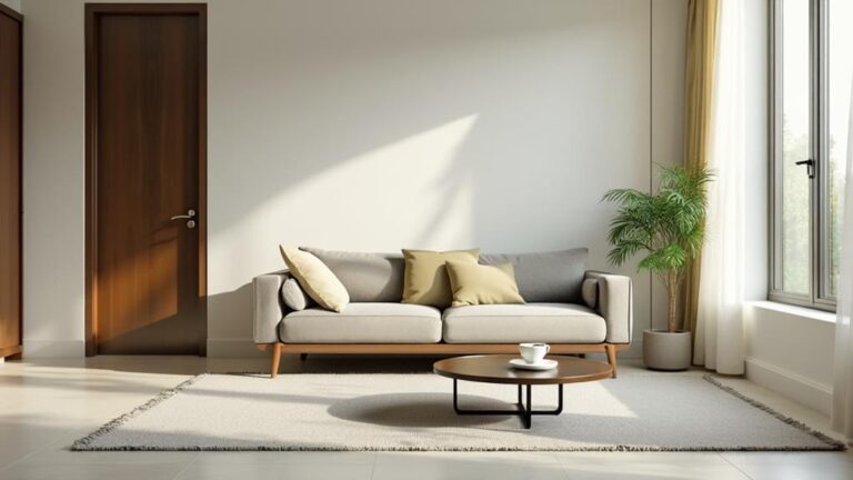
I've discovered that neutral color schemes create a serene and versatile foundation for any room in your home. By incorporating beige, cream, gray, and soft taupe, you can establish a calming atmosphere that enhances natural light and makes spaces feel more inviting. Layering different textures and tones adds depth without sacrificing tranquility. I've found that carefully chosen accent colors can provide focal points while maintaining serenity. Neutral palettes work well in every room, from cozy living spaces to spa-like bathrooms. With the right lighting and nature-inspired elements, you can transform your home into a peaceful oasis. There's so much more to explore in the world of neutral heaven.
What To Know
- Neutral color palettes create versatile foundations for serene spaces using beige, cream, gray, and soft taupe.
- Layering textures and tones with soft fabrics, natural woods, and subtle metallics adds depth to neutral schemes.
- Accent colors like soft pastels or muted jewel tones enhance visual interest without overwhelming neutral spaces.
- Room-specific neutral combinations, such as warm beige for living rooms or light gray for bathrooms, optimize each space's function.
- Proper lighting techniques, including natural light and warm white bulbs, enhance the calming effects of neutral color schemes.
Timeless Neutral Color Palettes
Timeless neutral color palettes offer a versatile foundation for creating serene and adaptable spaces.
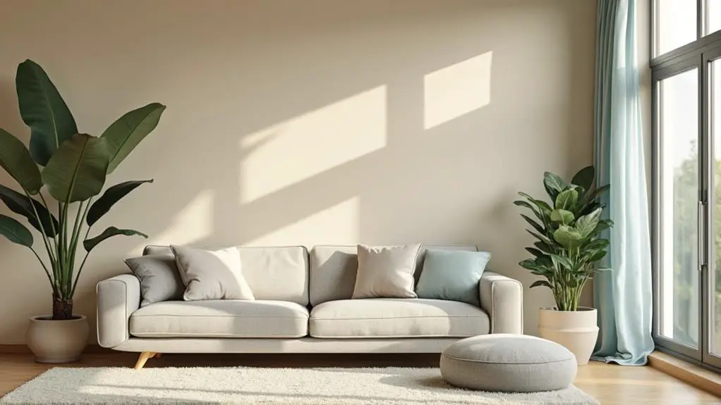
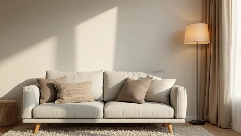
I've found that incorporating shades of beige, cream, gray, and soft taupe can establish a calming atmosphere in any room. These colors not only enhance natural light but also make spaces feel more inviting and spacious.
I love how neutral schemes allow for easy integration of accent colors and textures, promoting a cohesive design.
When I'm designing a room, I often mix matte and glossy finishes in neutral tones to add depth and interest without overwhelming the senses.
What's great about timeless neutral color palettes is that they serve as a classic foundation, adapting well to changing decor trends over time.
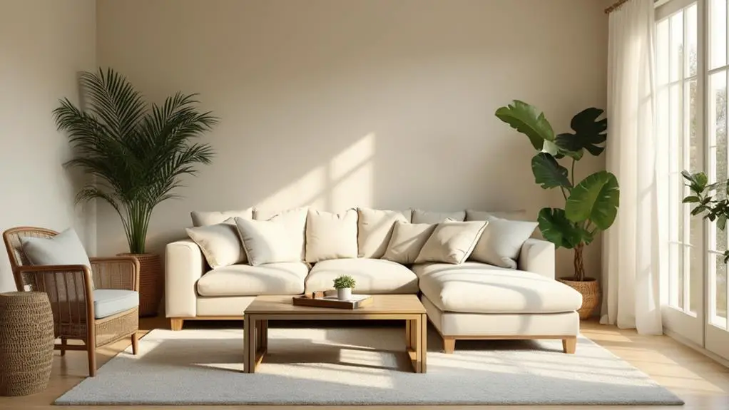
Creating Serene Spaces With Neutrals
I've found that creating serene spaces with neutrals isn't just about choosing the right colors; it's about how you use them.
By layering different textures and tones within a neutral palette, I can add depth and interest without sacrificing tranquility.
I'll also explore how carefully chosen accent colors can enhance the overall serenity while providing subtle focal points in a neutral room.
Layering Textures and Tones
When it comes to creating serene spaces with neutrals, layering textures and tones is key.
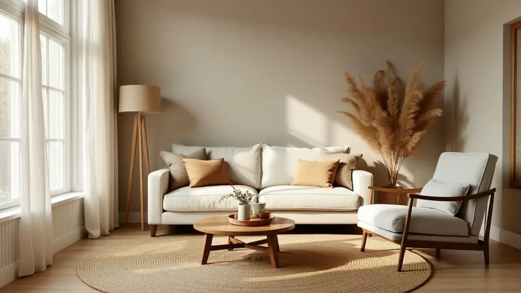
I've found that combining soft fabrics, natural woods, and subtle metallics enhances the depth and warmth of a neutral color palette. By incorporating various shades of beiges, grays, and whites, I can add visual interest while maintaining a calm, cohesive look.
I love using textured elements like bouclé cushions and woven rugs to create coziness without overwhelming the space with color.
To complement the neutral base, I'll often introduce accent pieces in muted, earthy tones like olive green or soft taupe. These subtle layers promote relaxation and comfort.
The strategic use of light and shadow through layered textures is essential in creating a dynamic yet peaceful environment.
This approach fosters balance and harmony throughout the room, resulting in a truly tranquil atmosphere.
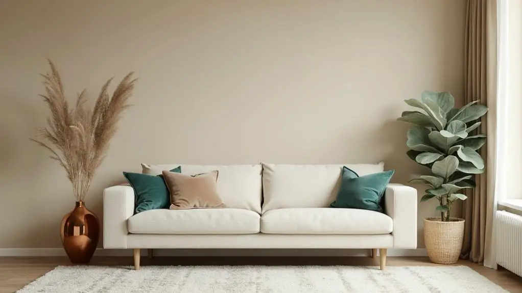
Accent Colors for Depth
Depth and dimension can transform a neutral space from bland to enchanting. I've found that incorporating accent colors is key to achieving this effect while maintaining a serene atmosphere.
Soft pastels and muted jewel tones work wonders in adding visual interest without overwhelming the senses. I love using dusty pink, sage green, or light blue to harmonize with neutral bases, enhancing the room's tranquility.
For a grounded feel, I turn to earthy colors like terracotta or muted mustard. These Calming Paint Colors create warmth without disrupting the peaceful palette.
I also consider texture when choosing accent colors, often opting for velvet or bouclé to add tactile appeal. The key is balance – ensuring these accent colors complement rather than dominate the neutral tones.
Layering Textures in Neutral Rooms
I've found that layering textures is key to creating depth in neutral rooms.
By mixing materials like soft linens, rough-hewn wood, and sleek metals, I can add visual interest without compromising the calming palette.
I also love to play with light reflection, using a combination of matte and glossy finishes to create subtle contrasts that elevate the overall design.
Mixing Materials for Depth
Layering textures in neutral rooms isn't just about aesthetics—it's a powerful design strategy that can transform a space from bland to breathtaking.
When I work with neutral color schemes, I'm always looking for ways to add depth through layering and texture. I love mixing materials like soft textiles, natural woods, and smooth ceramics to create a rich visual tapestry. Incorporating bouclé fabrics on cushions or throws adds a cozy element that contrasts beautifully with sleek surfaces.
I often play with matte and glossy finishes to create dynamic contrasts that elevate the room's sophistication. Earthy materials like stone or terracotta introduce organic warmth, while textured wall treatments such as shiplap or woven coverings add dimension.
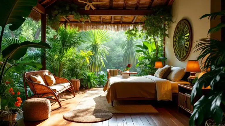
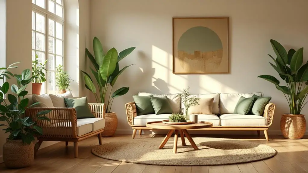
Incorporate Natural Elements
With natural elements, neutral rooms come alive. I've found that incorporating these elements adds depth and interest to calming color schemes. By using natural woods, stone, and textiles, I create a soothing atmosphere that complements the neutral palette perfectly. Let's explore some ways to bring nature indoors:
| Natural Element | Effect in Neutral Rooms |
|---|---|
| Wood | Adds warmth and texture |
| Stone | Provides visual weight |
| Linen | Softens the space |
| Plants | Introduces life and color |
| Driftwood | Creates organic shapes |
I love how these elements work together to define areas within open-concept spaces. A jute rug under a smooth leather chair, paired with a soft wool throw, instantly creates a cozy reading nook. By strategically layering textures, I guide the eye and promote a sense of organization, all while maintaining the calming color scheme of neutral rooms.
Play With Light Reflection
Natural elements set the stage, but light reflection takes neutral rooms to new heights.
I've found that layering textures is key to enhancing light interaction in these spaces. By combining soft fabrics, smooth metals, and natural woods, I create a dynamic atmosphere that's both inviting and visually rich.
I love using materials like bouclé, velvet, and linen to allow light to play differently across surfaces, even within a monochromatic palette. To amplify natural light, I strategically place reflective elements like glass or polished metals alongside matte finishes. This makes neutral tones appear more vibrant.
I also add depth with textured pieces like knotted wool rugs or woven throws, maintaining a calm ambiance. The interplay of light and texture notably influences the room's mood, creating a cozy yet elegant space.
Accent Colors for Neutral Schemes
Choosing the right accent colors can breathe life into a neutral color scheme, transforming a plain space into a visually engaging environment.
I've found that soft pastels like blush pink and mint green work wonders in adding a calming touch to neutral palettes without overpowering the space. For a bolder statement, I love using deep navy or emerald green to create striking contrasts against neutral backgrounds. These choices add sophistication and a modern edge to any room.
To elevate the look further, I often incorporate metallic accents like gold or brass. These introduce a touch of glamour and warmth, perfect for contemporary designs.
When I want to create more visual interest while maintaining serenity, I layer different shades of the same accent color. This technique keeps the overall look cohesive while adding depth to the neutral scheme.
Neutral Color Combinations by Room
Five distinct rooms offer unique opportunities for neutral color combinations that enhance their specific functions and atmospheres.
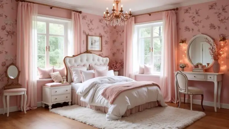
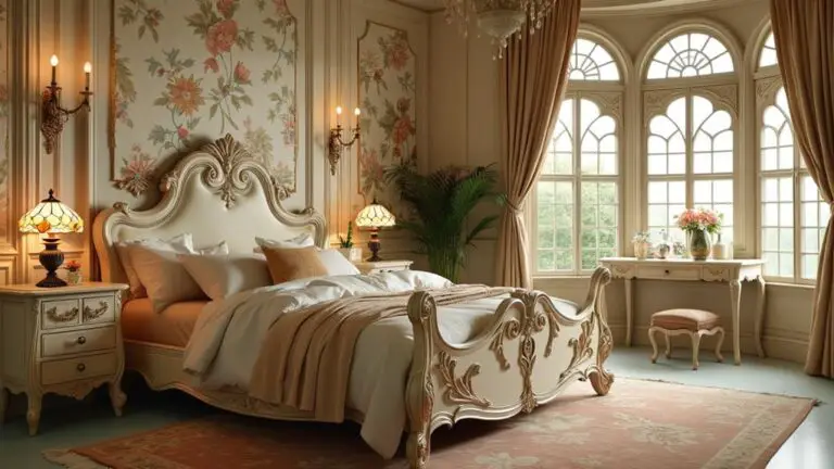
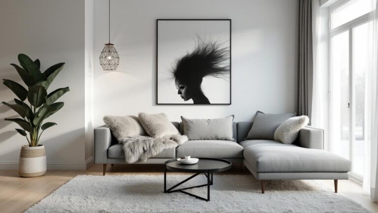
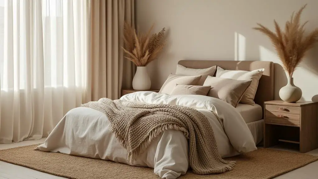
I've found that living rooms benefit from warm beige and soft ivory, creating a cozy yet versatile space. In bedrooms, I recommend delicate blue paired with warm gray for a tranquil environment conducive to restful sleep.
Kitchens come alive with cream and taupe, evoking comfort and warmth for family gatherings.
For a serene space, bathrooms shine with light gray and muted greens, offering a spa-like feel. Dining areas thrive with warm neutrals like sandy beige and soft taupe, fostering an inviting atmosphere for meals.
When incorporating neutral color combinations, consider:
- The room's purpose and desired mood
- Natural light availability
- Existing furniture and decor
These thoughtful pairings create harmonious, calming environments tailored to each room's unique needs.
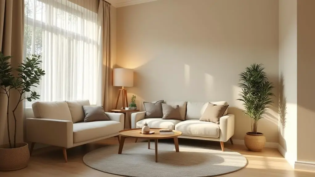
Lighting and Neutral Color Schemes
With neutral color schemes, lighting plays an essential role in enhancing the overall ambiance of a room.
I've found that natural light is a game-changer, warming up neutral tones and making spaces feel more inviting, especially during morning and afternoon hours.
When it comes to artificial lighting, I prefer warm white bulbs to complement neutral color schemes, creating a soft and cozy atmosphere without harsh shadows.
I always recommend layering different light sources to add depth and highlight architectural features.
Neutral colors reflect light better than darker hues, so I use this to my advantage to make rooms feel brighter and more spacious.
For ultimate control over the calming atmosphere, I install dimmer switches. This allows me to adjust lighting levels throughout the day, creating the perfect mood for any activity.
Incorporating Nature-Inspired Neutral Tones
Nature's palette offers a wealth of inspiration for calming color schemes.
I've found that incorporating nature-inspired neutral tones like warm beiges and soft grays can transform any room into a tranquil oasis. These calming colors mimic natural landscapes, promoting a sense of peace and relaxation.
To create a grounded atmosphere, I love using earthy hues such as olive green or sandy tan. These colors blend seamlessly with various decor styles, making them versatile for any space.
Here are three ways to enhance the visual appeal of nature-inspired neutrals:
- Add textural elements like wood or stone finishes
- Incorporate plants to reinforce the connection to the outdoors
- Use natural materials alongside neutral tones
Conclusion
I've come to appreciate the timeless appeal of neutral color schemes. They're versatile, calming, and create a perfect backdrop for any style. Curiously, studies show that 68% of people find neutral rooms more relaxing than those with bold colors. Whether I'm layering textures, adding subtle accents, or incorporating nature-inspired tones, I've learned that neutral palettes offer endless possibilities. With the right lighting and thoughtful combinations, I can create a serene haven in any space.