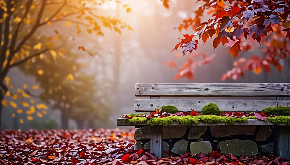
Color Palettes for Fall: Beyond Traditional Orange and Brown
I'm experimenting with fall color palettes that go beyond the traditional orange and brown hues. Rich jewel tones, earthy neutrals, and soft pastels are offering me a wealth of inspiration for creating a cozy autumnal aesthetic. Neutral palettes that mirror nature's muted tones, like fallen leaves and deep greens of foliage, are particularly caught my attention. I've discovered expert-approved palettes featuring unexpected shades like blush, terracotta, and olive that align with contemporary design trends. By exploring these innovative combinations, I'm revealing the secrets to crafting a unique and enchanting fall visual identity – and it's just the beginning.
Key Takeaways
- Fall color palettes extend beyond traditional orange and brown, encompassing rich jewel tones, earthy neutrals, and soft pastels.
- Neutral palettes mirror nature's muted tones, while seasonal palettes feature unexpected shades like blush, terracotta, and olive.
- Expert-approved palettes, such as Skobeloff + Champagne Pink + Golden Gate Bridge, promote calming atmospheres and modern twists.
- Mixing jewel tones with earthy neutrals creates striking visuals, while adding textures and lighting provides depth and engagement in designs.
Understanding Fall Color Inspiration
As I explore the world of fall color palettes, I find that understanding the season's diverse inspiration is key to crafting a harmonious and evocative visual narrative that resonates with audiences.
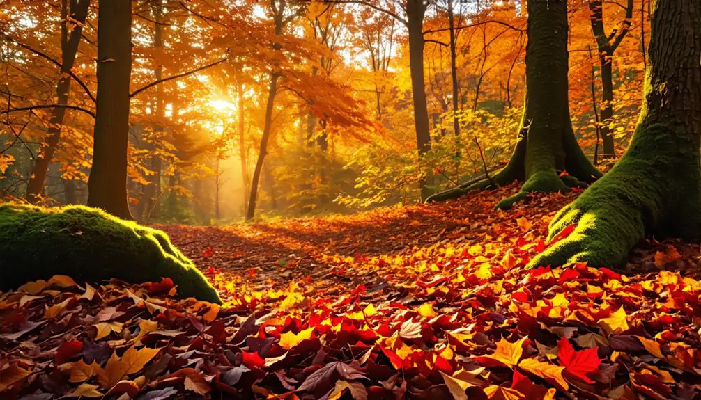
Fall colors extend far beyond the traditional rich oranges and browns, encompassing a rich array of jewel tones, earthy neutrals, and soft pastels that reflect the season's transformations.
To create a compelling autumn color combination, I consider the neutral color palette that nature provides during this time of year, from the muted tones of fallen leaves to the deep greens of foliage.
I find inspiration in seasonal color palettes that incorporate unexpected shades, such as blush, terracotta, and olive, which provide fresh alternatives that resonate with contemporary trends.
Utilizing color palette generators allows me to explore innovative combinations that capture the essence of fall.
By examining the full spectrum of fall colors, I can develop a nuanced understanding of the season's visual identity and create palettes that evoke the cozy aesthetic associated with autumn.
This understanding forms the foundation of crafting a fall color palette that truly resonates with audiences.
Emotional Significance of Colors
Building on my understanding of fall color inspiration, I now consider how the colors I choose can evoke specific emotions in my audience. I aim to use the emotional significance of colors to craft a visual narrative that resonates on a deeper level.
I realize that colors like red symbolize power and excitement, while warm shades like orange and yellow create a sense of warmth and coziness associated with autumn. Each color carries unique emotional connotations that can influence customer perceptions, making it vital for me to understand these meanings for effective communication.
I see how multi-shade combinations can enhance visual appeal and emotional impact, allowing me to evoke feelings of nostalgia and comfort through my color choices. The emotional significance of colors plays a critical role in branding strategies, particularly in industries like food and beverage, where colors like red and orange stimulate appetite.
Fall Color Palettes for 2024
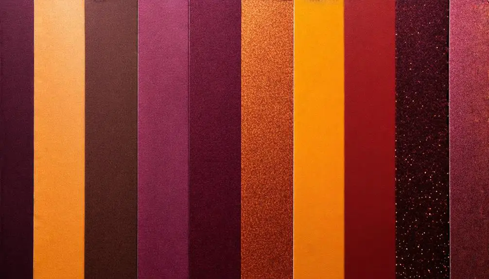
With an eye on the latest design trends, I'm exploring the 2024 fall color palettes, which promise to bring a fresh twist to traditional autumn shades with modern, unexpected hues.
I'm excited to see how earthy tones and rich jewel tones are being reimagined to create a contemporary fall aesthetic.
Expert-approved palettes, such as Skobeloff + Champagne Pink + Golden Gate Bridge, are using hex codes like #283d3b and #edddd4 to bring a new level of sophistication to the season.
Other unique palettes, like Rose Dust + Tumbleweed + Mn Blue, are offering slightly desaturated shades that promote a calming atmosphere.
These fall color palettes are crucial in enhancing design effectiveness, emotional connections, and seasonal relevance in branding efforts, making them essential for marketing strategies.
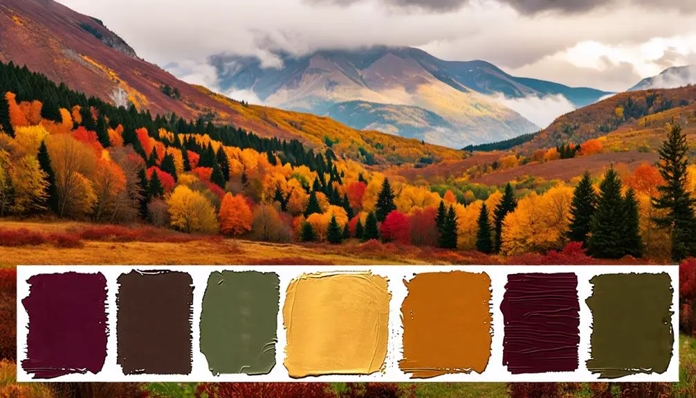
Detailed Fall Color Palettes
Exploring the 2024 fall color palettes in-depth, I'm breaking down five distinct palettes that showcase a range of autumnal tones, from traditional and cozy to modern and calming. Each palette offers a unique blend of colors that can be used for various design projects, including wedding colors. Here are a few of my favorites:
- Warm neutrals: The Tan + Brown Sugar + Almond Brown Palette is an earthy fall color palette that features a monochromatic scheme with warm, inviting tones.
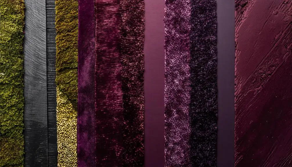
- Deep jewel tones: The Midnight Green + Ruby Red + Dark Orange Palette showcases rich colors that create a cozy and inviting atmosphere, perfect for a fall evening.
- Rich and bold: The Deep Space + Auburn + Indian Yellow Palette captures the essence of fall through its deep space and rich, bold colors, making it ideal for designs that require a pop of color.
From warm neutrals to deep jewel tones, these palettes offer a range of options for designers looking to incorporate the beauty of fall into their work.
Whether you're creating a wedding color scheme or simply looking for inspiration, these palettes are sure to provide a great starting point.
Additional Fall Color Palettes
I'm highlighting a few more fall color palettes that offer unique twists on traditional autumnal tones, introducing fresh combinations that can add some excitement to design projects.
One of my favorites is the Darkened Yellow + Dark Salmon + Tea Green palette, which livens up the usual autumn colors with vibrant greens and soft salmon tones. For a sweeter visual experience, I recommend the Sugar Plum + Coral + Light Salmon Palette, featuring soft, delicate hues that are perfect for a fresh take on fall designs.
If you're looking for a more grounded, earthy aesthetic, try incorporating Gunmetal + Desert Sand + Terra Cotta into your design. Alternatively, the Rose Dust + Tumbleweed + Mn Blue Palette offers calming, slightly desaturated shades that promote a serene atmosphere during the fall season.
Finally, Antique Brass + Desert Sand + Ash Gray introduces earthy tones that harmonize beautifully, enhancing the cozy feel of fall designs.
These palettes can add a unique spin to your fall projects, and I'm excited to experiment with them!
Tools for Color Palette Generation
Having a great fall color palette is just half the battle – now it's time to find the perfect tools to help generate and refine these palettes, making it easier to bring designs to life. As a designer, I'm always on the lookout for innovative tools to create stunning color schemes.
Here are my top 3 tools for generating fall color palettes:
- Coolors Color Palette Generator: This user-friendly tool offers premade fall palettes and customization options to create unique designs. I love experimenting with unexpected pops of color to add a modern twist to traditional fall tones.
- Color Hunt Palette Library: With its vast collection of fall-themed palettes, this library provides endless inspiration for designers looking to enhance their seasonal projects.
- Paletton Color Palette Generator: By utilizing a color wheel, this tool helps me find complementary colors that foster harmonious designs. I can effortlessly balance neutral shades with bold fall colors to create a cohesive color scheme.
These tools have revolutionized my design process, allowing me to create beautiful fall color palettes that captivate audiences.
Whether you're looking for a bold statement or a subtle accent, these tools are sure to help.
Color Palettes in Design
One of the most critical aspects of design, a well-crafted color palette can make or break the visual identity of a brand, which is why I always prioritize its development in my own design process.
When it comes to fall color palettes, I focus on creating a cozy atmosphere that evokes feelings of warmth and comfort. By incorporating deep greens, rich jewel tones, and warm neutrals, I can enhance the seasonal relevance of a brand and create an emotional response in its audience.
To guarantee precise application and consistency across various design mediums, I utilize hex codes for color selection. This leads to cohesive branding efforts that are instantly recognizable.
I also limit my color palettes to five shades to maintain clarity and enhance brand recognition while allowing for visual harmony in my designs. By creating complementary schemes with tools like color palette generators, I can assure that my chosen colors work well together and reflect the desired emotional tone.
This approach enables me to craft seasonally appropriate color palettes that elevate a brand's visual identity and leave a lasting impression.
Selecting the Right Color Palette
With a solid understanding of how to craft a cohesive color palette, I focus on the next step: selecting the right colors that not only reflect my brand's personality and values but also resonate with its target audience during the fall season.
I want to move beyond the traditional orange and brown, and explore other fall shades that can evoke the same warmth level and coziness. To do this, I consider the emotional impact of colors on my audience and how they can create a meaningful connection through my design choices.
Here are three key considerations I keep in mind when selecting a color palette for fall:
- Brand personality: I make certain that the colors I choose align with my brand's values and personality traits.
- Seasonal themes: I select colors that reflect the seasonal themes of fall, such as harvest, warmth, and coziness.
- Audience reactions: I test different color combinations to gauge audience reactions and preferences, refining my palette based on feedback.
Benefits of Fall Color Palettes
What makes fall color palettes particularly effective in branding and marketing strategies is their ability to evoke warmth, nostalgia, and emotional connections with audiences.
I've found that utilizing diverse fall color palettes can create visual interest and depth in designs, moving beyond traditional orange and brown to incorporate rich jewel tones and soft pastels. By doing so, I can tap into the emotional connections that audiences have with these colors, making my branding efforts more impactful.
I believe that seasonal color palettes, like those used in fall, help establish a cohesive identity in branding, ensuring consistency across various marketing materials and enhancing overall recognition.
Furthermore, incorporating unique color combinations from fall palettes can stimulate customer engagement and evoke feelings of comfort, making them particularly effective for food, beverage, and lifestyle brands.
The use of fall color palettes can also enhance storytelling in design, allowing for a more immersive experience that resonates with consumers' seasonal sentiments and preferences.
Incorporating Fall Palettes in Design
As I aim to create impactful branding efforts, I focus on incorporating fall palettes in design to tap into the seasonal sentiments and emotions of my audience.
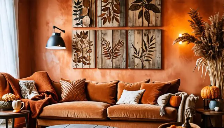
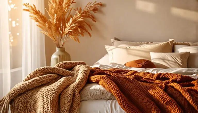
I use a mix of warm, rich, and muted colors that reflect the essence of autumn. I've found that using neutral tones as a base and adding pops of deep reds, warm yellows, and rich browns can evoke a sense of warmth and nostalgia.
Here are three ways I incorporate fall palettes into my design:
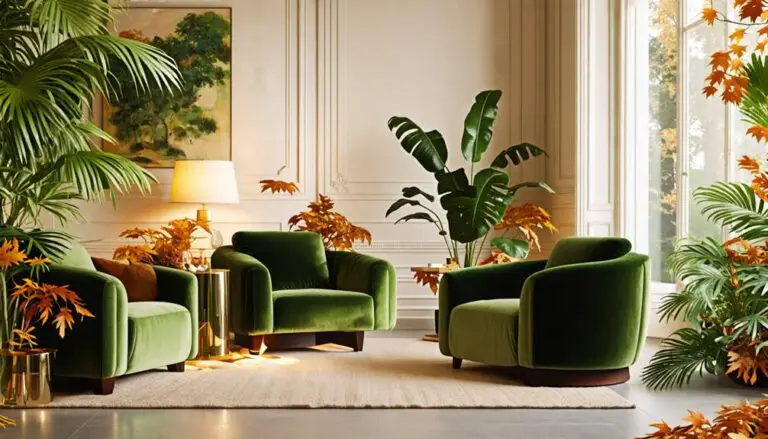
- Mixing jewel tones with earthy neutrals: I experiment with combining colors like emerald green and navy blue with neutral tones like beige and taupe to create visually striking designs.
- Adding textures and lighting: Incorporating textures and lighting alongside fall color palettes adds depth and visual interest to my designs, making them feel more dynamic and engaging.
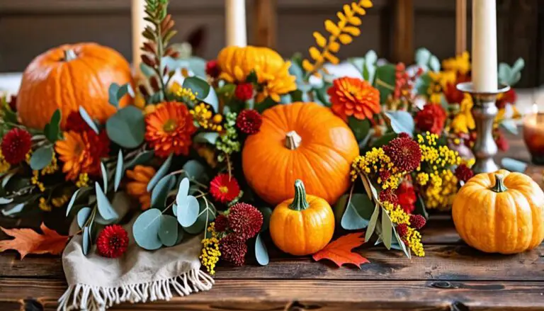
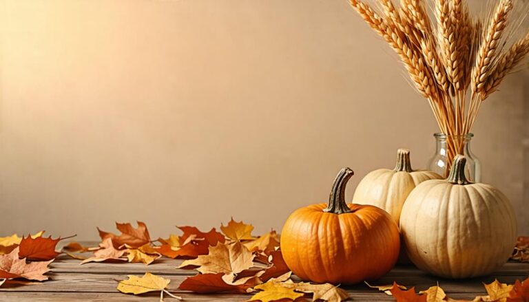
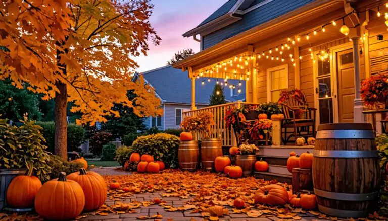
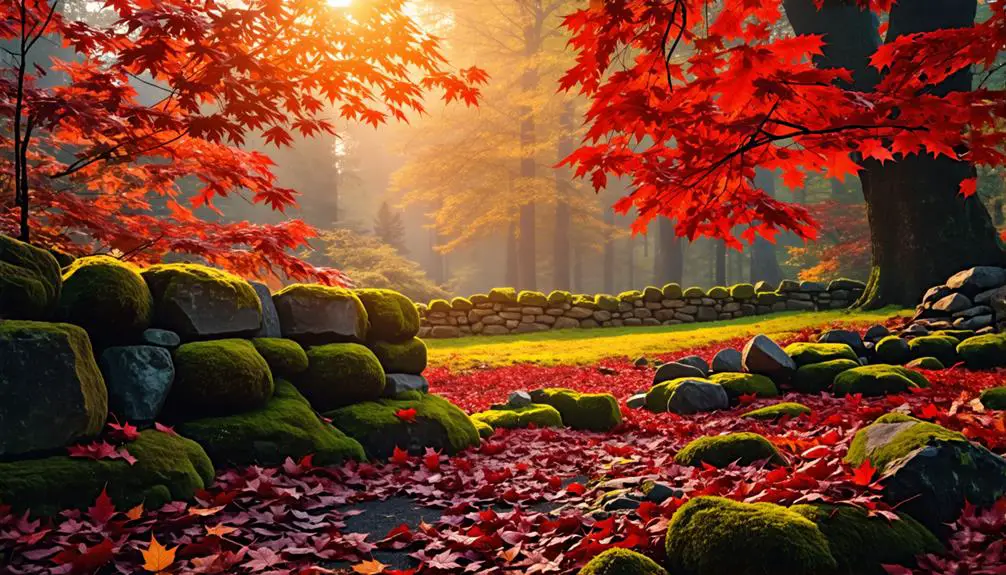
- Using seasonal imagery: I pair fall color palettes with seasonal imagery like leaves, pumpkins, and acorns to make my designs more relatable and emotionally impactful during fall promotions.
Conclusion
As I bid adieu to the vibrant hues of fall, I realize that this season's color palettes have left an indelible mark on my design psyche.
Like a medieval scribe illuminating manuscripts, I've unearthed hidden gems beyond the traditional orange and brown.
These bold, modern palettes will forever change the way I approach autumnal design.
With quill in hand, I'm ready to ink a new chapter in color exploration, where fall's warm tones meet innovative flair.